
At the University of Northampton, we’re once again pleased to join Anthology’s Fix Your Content Day – a 24-hour global event on Tuesday, November 18th, 2025 – aimed at creating more inclusive learning environment for all students. This is a brilliant initiative which encourages staff to improve the accessibility of digital course content using Blackboard Ally, which helps make NILE more inclusive, one fix at a time.
How do I get involved?
If you’d like to take part, simply email your Learning Technologist or the Learning Technology main email with the code of your NILE module. On the morning of November 18, email them a screenshot of your current Ally Accessibility score, then spend the day making improvements to your module content. By 8 PM, submit another screenshot of your final Ally score and you might just get a special mention in Unify, along with the satisfaction of knowing you’ve created a more accessible learning environment for your students.
Last year, Deborah Gardner joined previous years participants Charlotte Dann, Alison Powers, Simon Sneddon and Jean Edwards who have all embraced the challenge and helped create more inclusive NILE modules, making a real difference for their students.
What do I need to do on November 18?
Here’s a guide to getting involved in the Anthology Fix Your Content Day 2025:
- Use this guide to find your Module-Level Ally score and identify areas for improvement.
- Use Blackboard Ally to assess the accessibility of your materials. Ally provides feedback and suggests improvements, helping you prioritise changes that will have the greatest impact.
- Review Your Documents: Ensure that your PDFs, Word documents, and presentations use clear headings and tags that can be easily navigated by screen readers.
- Add Alt Text to Images: Include descriptive alt text for any images in your materials. This ensures that students using screen readers can engage with the visual content.
- Check your Captions: Accurate captions support not just students with hearing impairments, but also those studying in noisy environments or those who are non-native English speakers.
Need Help? Join Our Drop-In Session
To support you throughout the day, we’re also offering a face-to-face drop-in session between 10-4 in the drop-in zone next to the student union office in the Learning Hub. You can get help interpreting your Ally report, ask questions about accessibility improvements and make fixes with guidance from a friendly neighbourhood Learning Technologist
We hope you’ll join us on Tuesday, November 18 and make NILE more accessible. However, even if you can’t engage on the day, consider trying something new this semester – whether that’s adding clearer captions, using shorter filenames, or creating an Ultra document. Even small improvements can significantly transform the learning experience for all students.
Last week, we highlighted Fix Your Content Day, where staff were encouraged to take small steps towards improving the accessibility of their module sites. Today, we’re excited to share a success story from Deborah Gardner, a Lecturer in Business Management, who took part in the initiative and saw significant improvements in her module’s accessibility.
When Deborah checked her module site’s accessibility report, she found it at 88%. While this was a decent score, she knew there was room for improvement. “I went through the steps the report suggested,” she explained, starting with adding alternative text to diagrams in her PowerPoint slides and correcting low-visibility text. These changes quickly raised her score to 99%, and with a bit more effort, she soon reached the perfect 100%. “Some of the corrections were a little time-consuming, but the effort paid off when my overall score hit 100%,” she shared.
Key Learnings
Deborah’s experience highlighted a few valuable takeaways:
Custom ALT Text: One of Deborah’s recommendations is to write your own ALT text descriptions for images, rather than relying on automatic suggestions. “When I asked to use the suggested [ALT text], it didn’t really describe the image that well,” she noted. Crafting accurate and meaningful descriptions ensures that students using screen readers fully understand visual content.
Tackling PDFs: For Deborah, the most time-consuming task was correcting PDFs, but the improvements were well worth the time. Ensuring all content is accessible, even documents, can have a huge impact on student inclusion.
A Habit of Accessibility
Deborah encourages her colleagues to get into the habit of reviewing their accessibility reports regularly: “The first step is to check your report. Quite often, it will just involve a few tweaks, so it won’t be too demanding on your time. Get into the habit of checking it once a week to ensure your site remains accessible.”
She also suggests incorporating accessible practices from the very beginning: “It helps to get into the habit of providing descriptions for any images in your content right from the start—they’re less likely to flag up in the report that way.”
Next steps
While Deborah has seen firsthand the benefits of improving her module’s accessibility, she hopes to work with colleagues across the programme to adopt similar practices. By sharing her experience and success, she would like to help others to do the same, creating a more inclusive learning environment for all students.
Accessibility doesn’t have to be overwhelming, and as Deborah’s story shows, even a few small steps can make a big difference. For more tips and support, check out our original blog post here and don’t hesitate to reach out to your Learning Technologist for guidance.

At the University of Northampton, we’re committed to creating an inclusive learning environment for all students. As part of this commitment, we’re happy to celebrate the Anthology Fix Your Content Day on Thursday, October 3rd, 2024. This 24-hour event is designed to create more accessible and inclusive digital learning content using Blackboard Ally. So, why not join us in making NILE more accessible?
How do I get involved?
If you’d like to take part, simply email your Learning Technologist with the code of your NILE module. On the morning of October 3rd, email them a screenshot of your current Ally Accessibility score, then spend the day making improvements to your module content. By 8 PM, submit another screenshot of your final Ally score and you might just get a special mention in Unify, along with the satisfaction of knowing you’ve created a more accessible learning environment for your students.
In previous years, tutors like Jean Edwards and Charlotte Dann embraced this challenge and made fantastic progress using the Ally module accessibility reports to guide their changes. Their work helped create more inclusive NILE modules, making a real difference for their students.
What do I need to do on October 3rd?
Here’s a guide to getting involved in the Anthology Fix Your Content Day 2024:
- Use this guide to find your Module-Level Ally score and identify areas for improvement.
- Use Blackboard Ally to assess the accessibility of your materials. Ally provides feedback and suggests improvements, helping you prioritise changes that will have the greatest impact.
- Review Your Documents: Ensure that your PDFs, Word documents, and presentations use clear headings and tags that can be easily navigated by screen readers.
- Add Alt Text to Images: Include descriptive alt text for any images in your materials. This ensures that students using screen readers can engage with the visual content.
- Check your Captions: Accurate captions support not just students with hearing impairments, but also those studying in noisy environments or those who are non-native English speakers.
We hope you’ll join us on October 3rd and make NILE more accessible. However, even if you can’t engage on the day, consider trying something new this semester – whether that’s adding clearer captions, using shorter filenames, or creating an Ultra document. Even small improvements can significantly transform the learning experience for all students.
Contact your Learning Technologist if you have any questions.
At the University of Northampton, we are committed to fostering an inclusive learning environment. That’s why we’ve introduced the AI-powered tool in Blackboard Ultra that automatically generates alternative text (alt text) for images. This feature offers instructors the support they need to generate meaningful alternative text (alt text) for images quickly and efficiently.
The Challenge of Creating Alt Text
Writing descriptive and meaningful alt text isn’t always straightforward. Many times, instructors need a bit of inspiration to find the right words. Enter Ally’s AI Alt Text Assistant—a tool designed to take the guesswork out of writing alt text by automatically generating suggestions. This not only saves time but also enhances the accessibility of learning materials for visually impaired students.
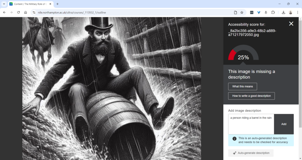
How Does the AI Alt Text Assistant Work?
Integrated directly into the Ally Instructor Feedback interface, the AI tool empowers instructors to address images without alt text more efficiently:
- Auto-Generate Description Button: When an image lacks a description, instructors can simply click the “Auto-Generate Description” button. The AI Alt Text Assistant will provide a concise and accurate suggestion based on the image’s content.
- Instructor Review and Control: Importantly, the AI does not automatically apply these suggestions. Each description requires instructor review, ensuring that the final text aligns with the course content and the image’s educational purpose. You can easily edit, refine, or remove the suggestions to suit your needs.
This combination of automation and instructor control guarantees that the alt text meets both accessibility standards and the specific context of your course materials.
Key Features and Benefits
- Time-Saving Automation: With just one click, you can generate accurate alt text suggestions, saving time while ensuring your materials are accessible.
- Instructor-Centred: The AI Alt Text Assistant empowers instructors by providing helpful suggestions, but leaves the final decision in your hands, giving you full control over the descriptions.
- Seamless Integration: This feature works within the existing Ally Instructor Feedback workflow, making it easy to fix accessibility issues as you work through your content.
Why Is This Important?
Creating accessible content isn’t just about meeting legal standards—it’s about ensuring that every student can engage with your materials. By incorporating alt text for images, you’re helping students who use screen readers to fully participate in the learning experience. Ally’s AI tool simplifies this process, helping you make your course content more inclusive with minimal effort.
Start Using the AI Alt Text Assistant Today
The new AI Alt Text Assistant is available now in Blackboard Ultra. Whether you’re updating old materials or creating new ones, this tool will help you maintain accessibility standards while saving valuable time.
For more information or guidance on using this new feature, check out our Ally guidance and get in touch with your Learning Technologist if you have any questions.
By leveraging this tool, you contribute to making learning at the University of Northampton a more inclusive experience for all.

Congratulations and well done to our three brilliant and amazing digital accessibility champions who took part in our challenge on the recent Global Accessibility Awareness Day. Simon Sneddon, Alison Power and returning competitor Jean Edwards join Charlotte Dann from last year in making their NILE sites more accessible for their students. This past year has placed huge demands on our time and our energy so it’s immensely wonderful these three were able to take part in the 2021 challenge alongside many other commitments. The 2021 trio contributed to Northampton’s final score of being 42nd in the World rankings and 4th in Europe.
The challenge was to see how much more accessible they could make their content within a short window of time. A prize for the most accessible NILE site, the most increasing in accessibility and the runner up prize for the greatest increase in accessibility. The results are in, and we are very pleased to announce the winners are:
- Simon Sneddon gets the highest overall score with a score of 97% on modules LAW2006 and LAW2007
- Jean Edwards gets the prize for the greatest increase with a whopping increase of 29% on PDT1068
- Alison Power gets the runner up prize for greatest increase – with a fantastic increase of 18% on MID3026
Alison, Simon and Jean can feel extremely proud of the effort they made, but if pride is not a significant enough reward for them, we have dug deep into the coffers to award them prizes of chocolate and sweets which we will be presenting to them in a modest online celebration. Formal wear is not obligatory, though neither are jogging bottoms.
Alison Power said, “engaging with this competition was a great opportunity to review my NILE site to ensure it is as accessible as possible. Ally is a fantastic tool to support Module Leaders in checking and revising content – I found it really user-friendly and wonder whether it could be included in the NILE Minimum Standards.”
Simons commented that “the main thing I think is to let people know that it is really straightforward to make documents and NILE sites accessible, and if you do it as you go along, it doesn’t take any additional time, so it is a win win activity. The Ally tool is really helpful, and the process also makes me think more about formatting and contrast and so on, and focusing way more on content than all the fancy things that PowerPoint can do. Substance not style.”
Jean, Simon, Alison and Charlotte now form our exciting celebrity digital accessibility tutors but of course we know there are many other tutors who couldn’t take part in the challenge but who are equally doing their bit to support and promote digital accessibility. We are immensely proud of the efforts made on a daily basis to make content and teaching more accessible.
If you would like training on making your content more accessible to students, please get in touch with your Learning Technologist and we will be happy to point you to resources or offer online one-to-one training. Making our content accessible to our audience does take time but as Simon observed if you can make the small changes early on in the process then what flows from that is infinitely improved.
Thursday May the 20th is Global Accessibility Awareness Day and to celebrate, the University is launching a competition to see who can make their NILE site the most accessible over the course of the day.
If you’d like to be involved, click the link below to register your NILE module and we’ll send you simple instructions on how to check your modules Accessibility score as well as some useful tips on how to use Ally to easily improve your site.
Enter using the Eventbrite form.
On the morning of the 20th of May you just need to email us a screenshot of your Accessibility score then send another screenshot by 8pm of your finishing Ally score. The module with the largest increase in score will win a small prize, a special mention in Unify and the satisfaction of creating an accessible site in line with the regulations for online materials.
Last year, Charlotte Dann and Jean Edwards took up the challenge to improve the accessibility of their NILE sites using the Ally tool. The challenge involved using the Ally module accessibility reports to incrementally make changes to their course which would make their course more accessible to students. The intrepid tutors worked during the day to make the necessary changes and by the end of the day, Northampton finished 28th in the World (3rd in Europe) for the greatest improvement!
Jean said, “I took part last year and in the process of checking and improving my accessibility scores on the day I learned a lot that I have been able to apply when I make new resources. I feel I can make my resources accessible as I devise them instead of retrospectively. This is time saving for me and supportive for students.”
Charlotte also got a lot out of the challenge. “Accessibility is an important issue for me, personally as well as within my teaching. When I saw the NILE site challenge relating to accessibility last year, I wanted to use it as an opportunity to test myself against how accessible I thought I was. And I really learned a lot! Some of the changes that were needed were relatively simple for me, but make a big difference to others – things like ensuring pictures have alternate text for screen readers, and referring to Word documents throughout my site rather than PDFs which some accessibility software find difficult to navigate. This has now translated into being aware of accessibility issues outside of the NILE module site (such as in social media use for hashtags and images), and the tool itself is something I refer back to for my modules since.”
We thank Jean and Charlotte for their involvement in the challenge and for sharing their experience. This has been a busy year for teaching staff and accessibility is unlikely to be a priority with so many other demands. However, as Charlotte says, a simple change of habit can have a massive impact for students.
If you don’t have the headspace for the challenge, please consider trying something new for September to make your content more accessible. It could be clearer captions for your videos, a shorter or more concise name for your next uploaded file or using less PDFs in your course.
Every NILE user deserves a first-rate digital experience so making your content accessible is really important. We hope this is a fun way to help you improve your sites. If you need help on the day then remember to contact your Learning Technologist who will happy to give you some training or tips to win.
For guidance on how to use the Ally tools in NILE, paste the following link into your browser:
https://askus.northampton.ac.uk/Learntech/faq/189667
For more assistance on using Ally then contact your Learning Technologist:
https://libguides.northampton.ac.uk/learntech/staff/nile-help/who-is-my-learning-technologist
On the 21st May as part of Global Accessibility Day, Charlotte Dann and Jean Edwards took up the challenge to improve the accessibility of their NILE sites using the Ally tool.
The challenge involved using the Ally module accessibility reports (https://askus.northampton.ac.uk/Learntech/faq/189667) to incrementally make changes to their course which would make their course more accessible and ultimately make their courses more accessible to students. The intrepid tutors worked during the day to make the necessary changes and improve Northampton’s score on the global league table:
By the end of the day, Northampton finished 28th in the World (3rd in Europe) for the greatest improvement.
Congratulations to Charlotte and Jean.
For more assistance on using Ally then contact your Learning Technologist – https://libguides.northampton.ac.uk/learntech/staff/nile-help/who-is-my-learning-technologist
All Northampton material must be accessible to everyone who needs it. If it isn’t, the content owner / University may be in breach of the Equality Act 2010 (see Appendix A) and the Public Sector Bodies (Websites and Mobile Applications) (No. 2) Accessibility Regulations 2018.
This means we start thinking about how users might access and use content and systems before we design or build anything.
Accessibility isn’t the responsibility of just one person. Everyone involved is responsible for making sure the service is accessible. Training is available to all staff to ensure they are able to recognise their responsibilities and create accessible content.
- If you have material on NILE then make use of Ally to help you improve the accessibility of content.
- If you produce any material which is viewed on the web then please follow the University guidance which is under the brand element of the MIR pages.
- If you are just starting with producing web based content then attend the training on creating accessible online content (Full details below):
Improving your knowledge of creating accessible online content.
During this one-hour essentials course, you will learn easy and practical steps to ensure your online content – documents, attachments, files, videos, animations and web copy – is accessible to anyone who needs it.
- To view dates and register for this training, please visit HR Self Service > navigate to the Course Catalogue > search for Creating Accessible Online Content.
- If you need help using the Staff Development function in U4BW please see the short user guide.
Perhaps an unruly dog ate a student’s earbuds and there’s your essential video lecture on Ethical Engineering they simply have to watch in the jam-packed silent carriage of the 8:50 from Leamington Spa. In this all too common circumstance captions are key.
What if you have an especially grating tone and listening to you might drive your students mad and you fear they might explode? Captions could well save the day.
Maybe they are unable to hear sounds or find it difficult listening for long periods and so want a transcription to peruse at their own pace. Students undoubtedly love your educational videos but sometimes you mumble, sometimes you drone and at times you rattle along with such fury you sound like you’re being hunted by assassins.
Captions can be the solution to many physical, practical, social or emotional situations. In fact, students can expect video captions for any good or silly reason and of course you would want the captions to be there just when they need them. You’d not expect them to make a special request. Nor would you force them to fill out endless forms justifying why, for heaven’s sake, they could possibly want captions. It’s not an unreasonable request. They’re not demanding the hour-long presentation on 18th century macroeconomics is transcribed into semaphore, are they? Now, that would be a stretch. No, video captions are not an eccentric request in these modern times with cinematic teaching so twenty-four everywhere.
And so, we at the University of Northampton provide machine-generated captions for each and every one of your video masterworks sat on our MediaSpace platform. Hurrah, you yell inwardly in the slowly shuffling lunchtime queue. But hold your horse! Machines are, in many ways, remarkable but in other ways they are, like many a politician or pig, decidedly lacking in wisdom, wit or common sense. Captions are one such area where machines often fare poorly.
Consider an average video about a common subject, like making a pot of tea. How does a machine make sense of the clear instructions provided by the skilled and softly-spoken tea-maker? Utter gobbledegook, dear reader or listener. The machine’s algorithm struggles with even the simplest step. How does the mighty machine transcribe the modest instruction of leaving the tea-bag to sit in the pot and brew?
“Leave the tea bark in the pottery and lettuce prove.”
Ridiculous twaddle.
And so, in truth, though you may have many videos in your MediaSpace account with automatically-generated captions, the understanding of this machine-made text can be like tumbling headfirst into word casserole. A linguistic hell for those with a dyslexic mind or for that matter anyone with a passing knowledge of the English language.
A potential calamity.
Thankfully, one solution is provided in the form of a simple caption-editing interface. This electronic instrument enables the gentle presenter to easily tweak the nonsense generated by the machine or equally the nonsense generated by the presenter themselves.
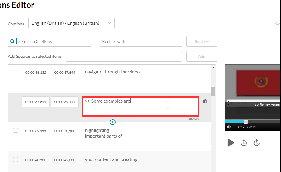
I should also point out if a student has a specific need for captions, you can ask for a human being of immense skill and dexterity to write the captions manually with the machine as a mere assistant to the process. Thankfully, this service does not require any form-filling nor nosey interrogation but is instead founded on unconditional trust and the belief it is not merely a trick on the part of the video author to avoid undesirable finger-strain.
So, in the concluding stage of this somewhat rambling essay can I offer my modest advice on some good practice, if you’re to provide captions to your audience with the least amount of extra work. Academic life is ordinarily bursting with work, so to add more without need is surely a woeful circumstance.
My first tip is to be clear.
Be clear in both in diction and in content. That is to say, don’t mumble or speak with your mouth full, as all good children are taught. Don’t assume your audience has the faintest idea what you are talking about. Don’t assume your audience even cares what you’re talking about. Sure, they may need to understand the knowledge you are trying to transfer but don’t confuse that with thinking they want to listen to you. If this is about knowledge transfer and not a fascinating fireside yarn of monsters and magic, then be clear. If, of course, your video is precisely a story of monsters and magic, accept my earnest apology and kindly share the link as I am exceptionally partial to such tales. This leads me to my second and mercifully final piece of advice.
Keep your video short.
Surely an irony coming from one such as I, able to spin a lengthy yarn from such meagre thread? Like the best party food, learning is sometimes best consumed in small bites and if you cannot keep it short, then please keep it engaging. Tell a story. Your audience may forgive you if your story interests them, but a limp string of facts is no better than a shopping list. Be clear and be interesting and your video captions will sing.
Now, go on your way and teach the world to sing.
At least 1 in 5 people in the UK have a long term illness, impairment or disability. Gov.uk (2018). In the academic year 18/19, just under 1000 University of Northampton students were actively using ASSIST services. This does not include students who may be registered with the Mental Health service but not ASSIST, nor those who have chosen not to disclose. Making your materials more accessible can help people with:
- impaired vision
- motor difficulties
- cognitive impairments or learning disabilities
- deafness or impaired hearing
For any resources you provide to your students, whether online, printed, or displayed in class, it is your responsibility to ensure they are accessible. This blog post acts as an introduction for teaching staff who are unfamiliar with making accessible content. My top 5 tips include:
- Clear Colours.
- Logical Layout.
- Eliminate Expressions.
- Image information.
- Descriptive Details.
1. Clear Colours
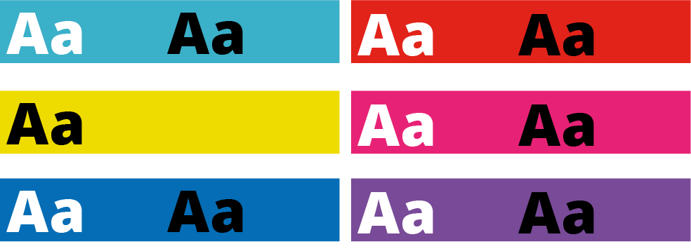
Accessibility standards specify a contrast ratio between text and background. The ratio can be lower when the text is larger. I would recommend only placing text on a strong colour for headlines or titles. I’ve included a link to a contrast checker at the bottom of the blog post.
When it comes to being able to read longer pieces of text easily, black text on white background seems to be accepted as the clearest combination. But for many people, such a stark contrast can make the text appear to skate about on the surface of the page. Using a very dark grey instead will help alleviate this. Some people find a pale coloured background really helps too. Ask your students if they prefer a pale blue or cream background colour behind text on your PowerPoint slides. Use Bold type to emphasise important words or phrases in the sentence, rather than using red. Finally, avoid placing text over an image, unless there is very clear contrast.
2. Logical Layout
This is one that will help most of your students. Make sure you describe things clearly and without ambiguity. For example, instead of putting a link to a journal article on NILE and write in brackets underneath, “you need to be logged into NELSON”; you should first explain how to log into NELSON. Obviously, this is just an example and third-year students can probably be expected to know how to log in to NELSON if they’ve done it before.
Another example is having content folders on NILE saying Week 1, Week 2, Week 3 etc. The folders are clear, consistent and not cluttered. Ensuring sites meet the NILE standards (see link below) means students have consistency across all the sites they use and can find what they need quickly and easily.
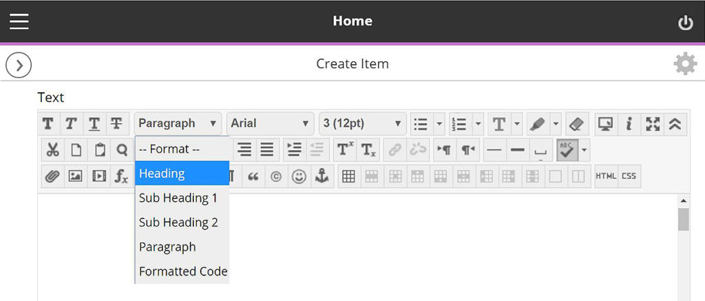
On NILE you can pick heading styles to help everyone using screen-readers. When you build a content Item, for example, there are options in the toolbar to let you change from Paragraph to Heading or Sub Headings. Use these instead of simply changing the size or making them bold. You can still change the size once you’ve set it to be heading/sub headings.
With larger pieces of text, the use of accurate, meaningful headings and subheadings can help students who feel overwhelmed by a sea of text and make it easier when people come back later on to find something. Learn more about how to use heading styles in the staff development training ‘Creating Accessible Online Content’. A link to more information about this is included at the end along with a download link to the ‘Designing for Diverse Learners’ posters, which explain all of this and more.
3. Eliminate Expressions
This is vital for the most important information and giving instructions. Following on from the previous step where we are making efforts to avoid ambiguity, the use of expressions or idioms can cause confusion or be completely undecipherable by others. Bear in mind, a lot of expressions taken literally word for word, make no sense at all.
Example 1:
“You will be assessed in just two weeks. It’s time to pull your socks up!”
I’m not sure how my socks relate to the assessment, much less the slouchiness
of them.
Example 2:
“You have been working really hard all year, don’t throw it all out the window now”.
Throw what out of the window? I wasn’t planning on throwing anything out of my window.
Example 3:
“You seem to have grasped the wrong end of the stick”.
What stick? I don’t remember any stick.
Similarly, avoid sarcasm and subtle exaggeration. Present information, clearly, simply and factually.
Besides certain groups of people taking them too literally, many expressions are becoming old-fashioned and you’ll find your younger students will have never heard them before. In these cases, they can identify that it is an expression and it shouldn’t be taken literally —but they still won’t know what it means.
Your challenge for the rest of the day is to make a mental note of every time you use an idiomatic expression. You might be surprised how much you do it.
4. Descriptive Details
Again, with giving instructions or perhaps announcements from your NILE site, make your expectations are clear, without making assumptions. For example, if you have students booked in for tutorials, make sure you tell them to arrive early, how long they have and what will happen if they turn up late.
They say a picture is worth a thousand words. I can’t help thinking this is a slight exaggeration. The key with this one is not to assume everyone will interpret the image in the same way. Just as you might teach your students to interpret data on a graph; when using images to convey information, make sure you explain what the picture is and what it’s there for. If you use a screenshot, for example, make sure we know what we’re looking at within the image. More importantly, don’t just put an image in place of any explanation.
Ideally, any images or charts should be there to enhance or add meaning to what you have said or written. In fact, most people benefit from something pictorial to illustrate the concept. However, if the image is there for purely decorative purposes, that’s fine and that brings us onto the number 5.
5. Image Information
In addition to people who won’t interpret an image the same way you do, there are those with visual impairments who can’t see the image at all. If you’ve followed the previous advice, you’ve already helped these people. However, there is standard practice for using images on the web, which are outlined in the Web Content Accessibility Guidelines (WCAG), see link below. When you upload an image to NILE, you will see two boxes just above the image preview. One says Image Description and the second one says Title. Give the image a relevant title and the description needs to contain the essential information. Think about why the image there, the information it presents, and then decide which words you can use to convey the same function and/or information. Leave the description blank if the image is for purely decorative. Get into the habit of doing this and it will become second nature. To help you with this, the Blackboard Ally tool has been applied to our NILE sites. You may have noticed a small gauge icon next to items you have uploaded. If you see a red/low gauge next to one of your images, click on it to find out how to improve its accessibility. Click the link at the end, to download Guidelines for Creating Accessible Word Documents. This is great resource for you to save a refer back to.
Caution: If you use an image that contains text, screen-readers will not be able to identify the words. Therefore, you must make sure any essential text from the image is also included as text. Try to select the text on the image below. You will see that you can because the text is not part of the image. In the previous images in this blog post, the text is part of the image.
Remember to book onto the staff development training session to learn how to make your Word docs and PowerPoints accessible too.
Find details on Unify in ‘staff development and training’.
Just 5 suggestions to help you support your students
In closing, please note I have deliberately avoided mentioning specific impairments, difficulties or disabilities in any of the sections. This is because I believe implementing each of these ideas can help all of your students, regardless of any additional needs. I strongly believe making accessible content should be about helping and supporting your students, not purely for the sake of meeting legislation.
It’s up to you to have an open dialogue with your particular students to find out ways in which you can support them. They do not have to disclose anything to you, and those who have declared something on their application probably won’t realise that information isn’t automatically passed onto their lecturers.
If you have content on Edublogs, please meet with your Learning Technologist before Sept 2020 for advice on making your Edublogs sites meet accessibility standards.
These were just my top 5 simple ways to get started, please leave a comment to let us know what tips and strategies you recommend. Thank you for reading and check out the links below if you want to learn more.
Further reading:
- JISC – UK law on accessibility
- GOV.UK – Understanding new accessibility requirements
- Creating content that works well with screenreaders
- WebAim – Contrast checker
- Designing for Diverse Learners. Posters
- AskUs – Editing Kaltura Captions
- AskUs – What is the new Ally accessibility tool in NILE?
- NILE Design standards 19/20
- Unify – Creating Accessible Online Content
Recent Posts
- 15 Years of the Learning Technology Blog!
- Blackboard Upgrade – March 2026
- Blackboard Upgrade – February 2026
- Blackboard Upgrade – January 2026
- Spotlight on Excellence: Bringing AI Conversations into Management Learning
- Blackboard Upgrade – December 2025
- Preparing for your Physiotherapy Apprenticeship Programme (PREP-PAP) by Fiona Barrett and Anna Smith
- Blackboard Upgrade – November 2025
- Fix Your Content Day 2025
- Blackboard Upgrade – October 2025
Tags
ABL Practitioner Stories Academic Skills Accessibility Active Blended Learning (ABL) ADE AI Artificial Intelligence Assessment Design Assessment Tools Blackboard Blackboard Learn Blackboard Upgrade Blended Learning Blogs CAIeRO Collaborate Collaboration Distance Learning Feedback FHES Flipped Learning iNorthampton iPad Kaltura Learner Experience MALT Mobile Newsletter NILE NILE Ultra Outside the box Panopto Presentations Quality Reflection SHED Submitting and Grading Electronically (SaGE) Turnitin Ultra Ultra Upgrade Update Updates Video Waterside XerteArchives
Site Admin

