Posts by: Learning Technologist
Today marked the third annual Learning Technology Symposium—a chance for our team to come together and explore emerging technologies in the age of AI. This year we took a slightly different approach, with three teams of three people working collaboratively to build a content, utilizing NILE’s built-in AI design assistant (AIDA) and Copilot.
Course Building
As most of the team were involved in the university-wide Copilot pilot programme, we have access to Copilot embedded throughout the Microsoft Office suite of tools, and at time of writing, the AIDA tools are as follows:
- Course structure suggestions
- Discussion generation
- Journal generation
- Rubric generation
- Assignment prompt generation
- Test question generation
- Question Bank generation
- Insert or generate images
- AI Conversations
- Generate Document layouts
At UON, all instructors can access these and benefit from the time saved as they build their NILE courses.
Attendees of the symposium worked on building a fictitious training package, which can later be populated and potentially used as a self-serve training in line with the University’s 5-year strategy.
Gamification
As well as the role of the trainer designing a course, we had the opportunity to experience the role of the trainee by engaging in a fully gamified session.
In three groups of three people, the element of competition was introduced. One of the learning packages will be chosen as the winner, and teams reviewed and voted on each other’s. This helps encourage certain personality types to strive for excellence and stay engaged.
Game Mechanics & Progression were implemented via a game board and activity cards. Each team had one dice, one counter and two sets of cards with activities on. Participants used the dice and counter to advance along the path on the board, if they landed on a blue square they drew a blue card, a pink square a pink card, and purple square was a wildcard. This provides a structured and visual way to track progress. Creates randomisation and chance, and —if cards were face-down— the element of surprise. It also meant that people had some freedom to decide how long to spend on activities. And although cards were identical, different teams were likely to be working on different things at any given time.
For autonomy & personalization the wildcard element empowers participants by giving them freedom in choosing their own task. The wildcard tasks carried their own competitivity, with the chance to win, by showing creativity and skill with AI tools. The idea was for teams to choose a task using an AI with one person in the team of three showing the others something new. A winning entry would have viewers questioning, “How did you make that?”
Individuals also had the chance to play a Hidden Objects game, looking for certain items in an image. These were placed into Microsoft Whiteboard and we all had fun pointing out the hidden items with the laser pointer. The images had been created with AI and could be used as an icebreaker at the start of a session. For instant feedback (another important key in gamification) H5P’s multiple hotspot feature can make the image interactive.
Variety of Technology
The event was also a great opportunity to use and experience a selection of the different technologies we have available to us at the University of Northampton. In the running of the session, we used MS Loop; for instructions and help guides, MS Whiteboard for collaborative activities, anonymous voting and affinity diagram. PowerPoint for the running order, and MS Forms for the feedback survey.
For the activities we used NILE tools including Padlet, Copilot, and a couple of other AI tools, which people had log-ins for or didn’t require a log in.
Data and Digital
Time was also spent as a team reviewing the University of Northampton’s Digital and Data Strategy 2025–2029, which outlines a vision for transforming how we work, teach, and support students. It was a chance to reflect on the important and strategic role the Learning Technology team plays in helping achieve these goals by 2030. From embedding digital literacy and promoting continuous learning, to supporting automation, data governance, and personalised learning experiences, our work is directly aligned with the strategy’s focus areas. It was encouraging to see how the tools and approaches we explored during the symposium neatly contribute to building a digitally empowered, inclusive, and forward thinking university that we can be proud to work for.
Conclusion
The AI Symposium 2025 was a brilliant mix of creativity, collaboration, and curiosity. It gave us the chance to explore new tools, test out ideas, and experience learning from both the trainer and trainee perspective. Whether it was building courses with AIDA, experimenting with Copilot, rolling dice on a game board, or enjoying Kelly’s delicious home-baked brownies, the day was full of energy and innovation.
If any of this has sparked your interest please do reach out to your Learning Technologist. We’re always happy to chat, share resources, or help you get started.
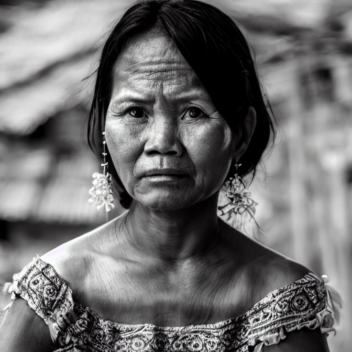
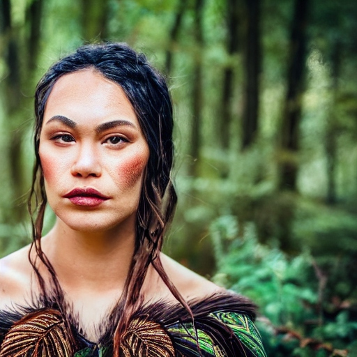
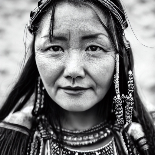
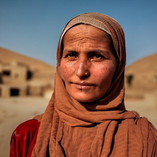
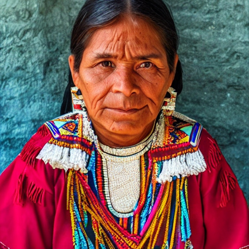
In celebration of International Women’s Day, I decided to use AI image generation to create some beautiful, photo-realistic portraits of women from around the world, in traditional dress.
Those of you who know me personally will know that I worked as a Freelance Graphic Designer for many years before becoming a Learning Technologist. Whilst I no longer work as a Graphic Designer, I do still keep my ear to the ground in the Graphic Design communities where there has been such a mixed reaction to AI image generation. It has been really interesting to watch the reactions over the last six months, as AI image generation has improved so much in such a short time. I, like many others, see it as an amazing and powerful tool that can work with a digital artist to produce pieces of work in a fraction of the time.
Limitations at the beginning
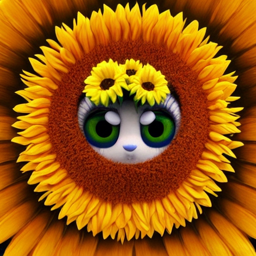
I used deepai.org, a free online text-to-image website that doesn’t require any login or registration, to play around and explore this new medium. For those simply wanting to type a keyword or two and see the result, it is really good fun. You could waste hours of your life just typing in different keywords and seeing what you get. It’s just so much fun creating weird and wonderful images! Here was one of my first attempts. I’d just asked for a sunflower, I wasn’t expecting a little Panda face peering out from the middle. I quickly learned what I’d done wrong and was determined to get better control over the results.
Writing Prompts: There is a skill to it!
I went back to the Graphic Design community blogs and YouTube videos where I’d seen absolutely stunning results, with futuristic and surreal city-scapes and weird fantastical creatures. Most of the designers I saw are using a platform called Midjourney. Midjourney offers a free trial and then a monthly subscription of just $10 a month for their cheapest plan. These AI artists, and yes I will call them artists despite how controversial that is, are using and sharing specific prompts that, through trial and error, they have found work really effectively to achieve certain visual effects.
It is quite well accepted that AI can’t do hands and often can’t do faces particularly well. I often see lions with 6 legs. You end up with some fairly disturbing images sometimes. The image below was created when I asked for a scene with The Queen of England. You’ll see in this example what I mean when I say it can’t do faces. (The little furry, three-eared creature, with no eyes, was supposed to be Paddington 😞).

Harnessing the power of AI
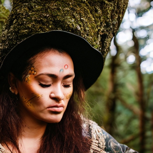
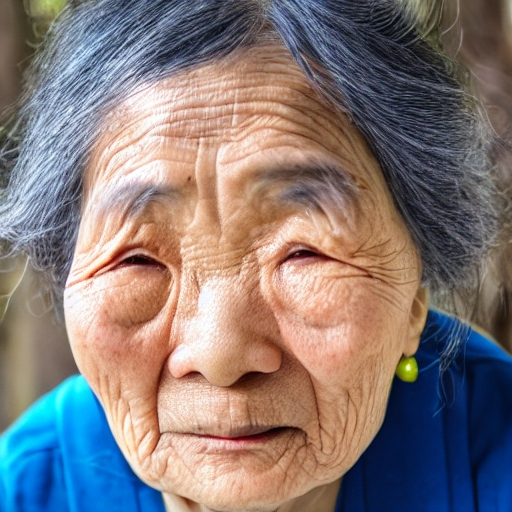
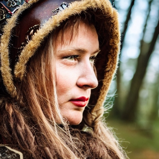
Despite using a free AI image generator, which states very clearly on its homepage NOT to expect photo realism, I was amazed by these results. I was blown away by the quality of all the images that came out, and the ones I’ve omitted from my gallery below, I’ve only done so because they looked a bit too airbrushed.
The prompt I generally used went as follows; (X is the nationality)
“Create a portrait of a traditional X woman, clear facial features, cinematic, 35mm lens, f/1.8, accent lighting, global illumination"
Why don’t you give it a go and try a different nationality? I’d love to hear how you got on.
A much longer version of this prompt was originally shared on Reddit and I took it from a YouTube video. You can watch if you want to understand more about what some of those elements are in the prompt — https://youtu.be/KXCVBu4btUk. (Photographers reading this will already have recognised some of those terms).


How AI image generation works
You may be looking at the images, wondering who these people are and whether they want AI using their faces. Well, you may be surprised to find out that none of these women are real people. They do not exist. You will not find these faces anywhere on the internet. Of course, coincidently, they might happen to look like someone in the world, but the faces, along with the rest of the image, are created by AI.
For example, if I want to paint a picture of a horse, I don’t have a horse to look at, so I’ll find a number of images on the internet to observe the proportions, the face shape, the mane, etc. I look at lots of different images from different angles to get a good idea of what it looks like. Then I’ll do my painting based on what I’ve observed. Similarly, AI will look at thousands of images on the Internet based on the specifics you’d put in your prompt. It then uses that information to create a brand new, original (Royalty Free*) image just for you. If you don’t like it, you can just tweak your prompt and it’ll make you a brand new, original image.
*Check the T&Cs of the platform you are using
Moving forward with AI
AI is here to stay whether we like it or not. I hope that we can appreciate it for what it can do for us, and embrace the technology. I am all for technology that can save us time and AI image generation certainly does that. Does it replace the artist? No, not necessarily. As you have seen in the examples, there is a skill, and you do have to learn how to get the best results. I look forward to seeing the images get better and better.
At least 1 in 5 people in the UK have a long term illness, impairment or disability. Gov.uk (2018). In the academic year 18/19, just under 1000 University of Northampton students were actively using ASSIST services. This does not include students who may be registered with the Mental Health service but not ASSIST, nor those who have chosen not to disclose. Making your materials more accessible can help people with:
- impaired vision
- motor difficulties
- cognitive impairments or learning disabilities
- deafness or impaired hearing
For any resources you provide to your students, whether online, printed, or displayed in class, it is your responsibility to ensure they are accessible. This blog post acts as an introduction for teaching staff who are unfamiliar with making accessible content. My top 5 tips include:
- Clear Colours.
- Logical Layout.
- Eliminate Expressions.
- Image information.
- Descriptive Details.
1. Clear Colours
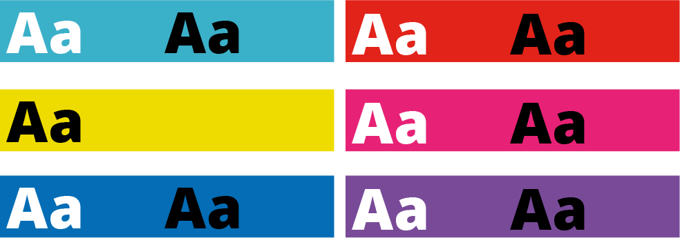
Accessibility standards specify a contrast ratio between text and background. The ratio can be lower when the text is larger. I would recommend only placing text on a strong colour for headlines or titles. I’ve included a link to a contrast checker at the bottom of the blog post.
When it comes to being able to read longer pieces of text easily, black text on white background seems to be accepted as the clearest combination. But for many people, such a stark contrast can make the text appear to skate about on the surface of the page. Using a very dark grey instead will help alleviate this. Some people find a pale coloured background really helps too. Ask your students if they prefer a pale blue or cream background colour behind text on your PowerPoint slides. Use Bold type to emphasise important words or phrases in the sentence, rather than using red. Finally, avoid placing text over an image, unless there is very clear contrast.
2. Logical Layout
This is one that will help most of your students. Make sure you describe things clearly and without ambiguity. For example, instead of putting a link to a journal article on NILE and write in brackets underneath, “you need to be logged into NELSON”; you should first explain how to log into NELSON. Obviously, this is just an example and third-year students can probably be expected to know how to log in to NELSON if they’ve done it before.
Another example is having content folders on NILE saying Week 1, Week 2, Week 3 etc. The folders are clear, consistent and not cluttered. Ensuring sites meet the NILE standards (see link below) means students have consistency across all the sites they use and can find what they need quickly and easily.
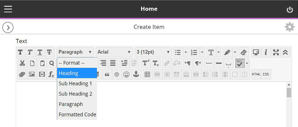
On NILE you can pick heading styles to help everyone using screen-readers. When you build a content Item, for example, there are options in the toolbar to let you change from Paragraph to Heading or Sub Headings. Use these instead of simply changing the size or making them bold. You can still change the size once you’ve set it to be heading/sub headings.
With larger pieces of text, the use of accurate, meaningful headings and subheadings can help students who feel overwhelmed by a sea of text and make it easier when people come back later on to find something. Learn more about how to use heading styles in the staff development training ‘Creating Accessible Online Content’. A link to more information about this is included at the end along with a download link to the ‘Designing for Diverse Learners’ posters, which explain all of this and more.
3. Eliminate Expressions
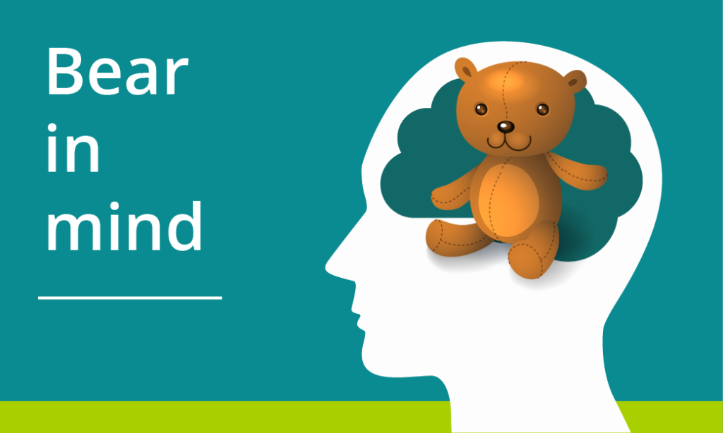
This is vital for the most important information and giving instructions. Following on from the previous step where we are making efforts to avoid ambiguity, the use of expressions or idioms can cause confusion or be completely undecipherable by others. Bear in mind, a lot of expressions taken literally word for word, make no sense at all.
Example 1:
“You will be assessed in just two weeks. It’s time to pull your socks up!”
I’m not sure how my socks relate to the assessment, much less the slouchiness
of them.
Example 2:
“You have been working really hard all year, don’t throw it all out the window now”.
Throw what out of the window? I wasn’t planning on throwing anything out of my window.
Example 3:
“You seem to have grasped the wrong end of the stick”.
What stick? I don’t remember any stick.
Similarly, avoid sarcasm and subtle exaggeration. Present information, clearly, simply and factually.
Besides certain groups of people taking them too literally, many expressions are becoming old-fashioned and you’ll find your younger students will have never heard them before. In these cases, they can identify that it is an expression and it shouldn’t be taken literally —but they still won’t know what it means.
Your challenge for the rest of the day is to make a mental note of every time you use an idiomatic expression. You might be surprised how much you do it.
4. Descriptive Details
Again, with giving instructions or perhaps announcements from your NILE site, make your expectations are clear, without making assumptions. For example, if you have students booked in for tutorials, make sure you tell them to arrive early, how long they have and what will happen if they turn up late.
They say a picture is worth a thousand words. I can’t help thinking this is a slight exaggeration. The key with this one is not to assume everyone will interpret the image in the same way. Just as you might teach your students to interpret data on a graph; when using images to convey information, make sure you explain what the picture is and what it’s there for. If you use a screenshot, for example, make sure we know what we’re looking at within the image. More importantly, don’t just put an image in place of any explanation.
Ideally, any images or charts should be there to enhance or add meaning to what you have said or written. In fact, most people benefit from something pictorial to illustrate the concept. However, if the image is there for purely decorative purposes, that’s fine and that brings us onto the number 5.
5. Image Information
In addition to people who won’t interpret an image the same way you do, there are those with visual impairments who can’t see the image at all. If you’ve followed the previous advice, you’ve already helped these people. However, there is standard practice for using images on the web, which are outlined in the Web Content Accessibility Guidelines (WCAG), see link below. When you upload an image to NILE, you will see two boxes just above the image preview. One says Image Description and the second one says Title. Give the image a relevant title and the description needs to contain the essential information. Think about why the image there, the information it presents, and then decide which words you can use to convey the same function and/or information. Leave the description blank if the image is for purely decorative. Get into the habit of doing this and it will become second nature. To help you with this, the Blackboard Ally tool has been applied to our NILE sites. You may have noticed a small gauge icon next to items you have uploaded. If you see a red/low gauge next to one of your images, click on it to find out how to improve its accessibility. Click the link at the end, to download Guidelines for Creating Accessible Word Documents. This is great resource for you to save a refer back to.
Caution: If you use an image that contains text, screen-readers will not be able to identify the words. Therefore, you must make sure any essential text from the image is also included as text. Try to select the text on the image below. You will see that you can because the text is not part of the image. In the previous images in this blog post, the text is part of the image.
Remember to book onto the staff development training session to learn how to make your Word docs and PowerPoints accessible too.
Find details on Unify in ‘staff development and training’.
Just 5 suggestions to help you support your students
In closing, please note I have deliberately avoided mentioning specific impairments, difficulties or disabilities in any of the sections. This is because I believe implementing each of these ideas can help all of your students, regardless of any additional needs. I strongly believe making accessible content should be about helping and supporting your students, not purely for the sake of meeting legislation.
It’s up to you to have an open dialogue with your particular students to find out ways in which you can support them. They do not have to disclose anything to you, and those who have declared something on their application probably won’t realise that information isn’t automatically passed onto their lecturers.
If you have content on Edublogs, please meet with your Learning Technologist before Sept 2020 for advice on making your Edublogs sites meet accessibility standards.
These were just my top 5 simple ways to get started, please leave a comment to let us know what tips and strategies you recommend. Thank you for reading and check out the links below if you want to learn more.
Further reading:
- JISC – UK law on accessibility
- GOV.UK – Understanding new accessibility requirements
- Creating content that works well with screenreaders
- WebAim – Contrast checker
- Designing for Diverse Learners. Posters
- AskUs – Editing Kaltura Captions
- AskUs – What is the new Ally accessibility tool in NILE?
- NILE Design standards 19/20
- Unify – Creating Accessible Online Content
