5 simple ways to make content accessible for your students

At least 1 in 5 people in the UK have a long term illness, impairment or disability. Gov.uk (2018). In the academic year 18/19, just under 1000 University of Northampton students were actively using ASSIST services. This does not include students who may be registered with the Mental Health service but not ASSIST, nor those who have chosen not to disclose. Making your materials more accessible can help people with:
- impaired vision
- motor difficulties
- cognitive impairments or learning disabilities
- deafness or impaired hearing
For any resources you provide to your students, whether online, printed, or displayed in class, it is your responsibility to ensure they are accessible. This blog post acts as an introduction for teaching staff who are unfamiliar with making accessible content. My top 5 tips include:
- Clear Colours.
- Logical Layout.
- Eliminate Expressions.
- Image information.
- Descriptive Details.
1. Clear Colours

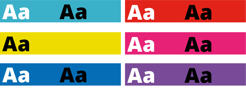
Accessibility standards specify a contrast ratio between text and background. The ratio can be lower when the text is larger. I would recommend only placing text on a strong colour for headlines or titles. I’ve included a link to a contrast checker at the bottom of the blog post.
When it comes to being able to read longer pieces of text easily, black text on white background seems to be accepted as the clearest combination. But for many people, such a stark contrast can make the text appear to skate about on the surface of the page. Using a very dark grey instead will help alleviate this. Some people find a pale coloured background really helps too. Ask your students if they prefer a pale blue or cream background colour behind text on your PowerPoint slides. Use Bold type to emphasise important words or phrases in the sentence, rather than using red. Finally, avoid placing text over an image, unless there is very clear contrast.
2. Logical Layout
This is one that will help most of your students. Make sure you describe things clearly and without ambiguity. For example, instead of putting a link to a journal article on NILE and write in brackets underneath, “you need to be logged into NELSON”; you should first explain how to log into NELSON. Obviously, this is just an example and third-year students can probably be expected to know how to log in to NELSON if they’ve done it before.
Another example is having content folders on NILE saying Week 1, Week 2, Week 3 etc. The folders are clear, consistent and not cluttered. Ensuring sites meet the NILE standards (see link below) means students have consistency across all the sites they use and can find what they need quickly and easily.

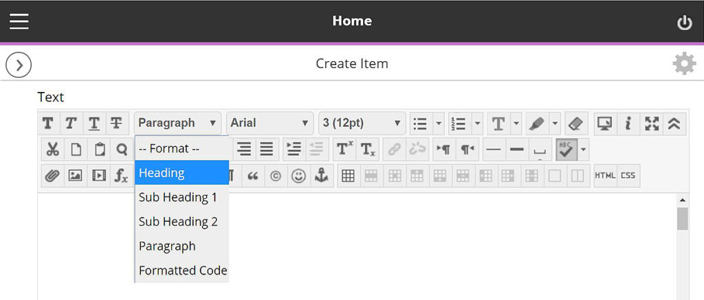
On NILE you can pick heading styles to help everyone using screen-readers. When you build a content Item, for example, there are options in the toolbar to let you change from Paragraph to Heading or Sub Headings. Use these instead of simply changing the size or making them bold. You can still change the size once you’ve set it to be heading/sub headings.
With larger pieces of text, the use of accurate, meaningful headings and subheadings can help students who feel overwhelmed by a sea of text and make it easier when people come back later on to find something. Learn more about how to use heading styles in the staff development training ‘Creating Accessible Online Content’. A link to more information about this is included at the end along with a download link to the ‘Designing for Diverse Learners’ posters, which explain all of this and more.
3. Eliminate Expressions

This is vital for the most important information and giving instructions. Following on from the previous step where we are making efforts to avoid ambiguity, the use of expressions or idioms can cause confusion or be completely undecipherable by others. Bear in mind, a lot of expressions taken literally word for word, make no sense at all.
Example 1:
“You will be assessed in just two weeks. It’s time to pull your socks up!”
I’m not sure how my socks relate to the assessment, much less the slouchiness
of them.
Example 2:
“You have been working really hard all year, don’t throw it all out the window now”.
Throw what out of the window? I wasn’t planning on throwing anything out of my window.
Example 3:
“You seem to have grasped the wrong end of the stick”.
What stick? I don’t remember any stick.
Similarly, avoid sarcasm and subtle exaggeration. Present information, clearly, simply and factually.
Besides certain groups of people taking them too literally, many expressions are becoming old-fashioned and you’ll find your younger students will have never heard them before. In these cases, they can identify that it is an expression and it shouldn’t be taken literally —but they still won’t know what it means.
Your challenge for the rest of the day is to make a mental note of every time you use an idiomatic expression. You might be surprised how much you do it.
4. Descriptive Details
Again, with giving instructions or perhaps announcements from your NILE site, make your expectations are clear, without making assumptions. For example, if you have students booked in for tutorials, make sure you tell them to arrive early, how long they have and what will happen if they turn up late.
They say a picture is worth a thousand words. I can’t help thinking this is a slight exaggeration. The key with this one is not to assume everyone will interpret the image in the same way. Just as you might teach your students to interpret data on a graph; when using images to convey information, make sure you explain what the picture is and what it’s there for. If you use a screenshot, for example, make sure we know what we’re looking at within the image. More importantly, don’t just put an image in place of any explanation.
Ideally, any images or charts should be there to enhance or add meaning to what you have said or written. In fact, most people benefit from something pictorial to illustrate the concept. However, if the image is there for purely decorative purposes, that’s fine and that brings us onto the number 5.
5. Image Information
In addition to people who won’t interpret an image the same way you do, there are those with visual impairments who can’t see the image at all. If you’ve followed the previous advice, you’ve already helped these people. However, there is standard practice for using images on the web, which are outlined in the Web Content Accessibility Guidelines (WCAG), see link below. When you upload an image to NILE, you will see two boxes just above the image preview. One says Image Description and the second one says Title. Give the image a relevant title and the description needs to contain the essential information. Think about why the image there, the information it presents, and then decide which words you can use to convey the same function and/or information. Leave the description blank if the image is for purely decorative. Get into the habit of doing this and it will become second nature. To help you with this, the Blackboard Ally tool has been applied to our NILE sites. You may have noticed a small gauge icon next to items you have uploaded. If you see a red/low gauge next to one of your images, click on it to find out how to improve its accessibility. Click the link at the end, to download Guidelines for Creating Accessible Word Documents. This is great resource for you to save a refer back to.
Caution: If you use an image that contains text, screen-readers will not be able to identify the words. Therefore, you must make sure any essential text from the image is also included as text. Try to select the text on the image below. You will see that you can because the text is not part of the image. In the previous images in this blog post, the text is part of the image.
Remember to book onto the staff development training session to learn how to make your Word docs and PowerPoints accessible too.
Find details on Unify in ‘staff development and training’.
Just 5 suggestions to help you support your students
In closing, please note I have deliberately avoided mentioning specific impairments, difficulties or disabilities in any of the sections. This is because I believe implementing each of these ideas can help all of your students, regardless of any additional needs. I strongly believe making accessible content should be about helping and supporting your students, not purely for the sake of meeting legislation.
It’s up to you to have an open dialogue with your particular students to find out ways in which you can support them. They do not have to disclose anything to you, and those who have declared something on their application probably won’t realise that information isn’t automatically passed onto their lecturers.
If you have content on Edublogs, please meet with your Learning Technologist before Sept 2020 for advice on making your Edublogs sites meet accessibility standards.
These were just my top 5 simple ways to get started, please leave a comment to let us know what tips and strategies you recommend. Thank you for reading and check out the links below if you want to learn more.
Further reading:
- JISC – UK law on accessibility
- GOV.UK – Understanding new accessibility requirements
- Creating content that works well with screenreaders
- WebAim – Contrast checker
- Designing for Diverse Learners. Posters
- AskUs – Editing Kaltura Captions
- AskUs – What is the new Ally accessibility tool in NILE?
- NILE Design standards 19/20
- Unify – Creating Accessible Online Content
Recent Posts
- 15 Years of the Learning Technology Blog!
- Blackboard Upgrade – March 2026
- Blackboard Upgrade – February 2026
- Blackboard Upgrade – January 2026
- Spotlight on Excellence: Bringing AI Conversations into Management Learning
- Blackboard Upgrade – December 2025
- Preparing for your Physiotherapy Apprenticeship Programme (PREP-PAP) by Fiona Barrett and Anna Smith
- Blackboard Upgrade – November 2025
- Fix Your Content Day 2025
- Blackboard Upgrade – October 2025
Tags
ABL Practitioner Stories Academic Skills Accessibility Active Blended Learning (ABL) ADE AI Artificial Intelligence Assessment Design Assessment Tools Blackboard Blackboard Learn Blackboard Upgrade Blended Learning Blogs CAIeRO Collaborate Collaboration Distance Learning Feedback FHES Flipped Learning iNorthampton iPad Kaltura Learner Experience MALT Mobile Newsletter NILE NILE Ultra Outside the box Panopto Presentations Quality Reflection SHED Submitting and Grading Electronically (SaGE) Turnitin Ultra Ultra Upgrade Update Updates Video Waterside XerteArchives
Site Admin

