Currently viewing the tag: "Tools"
The Learntech Team note that staff who are exploring new tools with their students should undertake a number of considerations when these are being reviewed:
Always start with the reason for the tool and have a chat with your Learning Technologist in the first instance. There may already be licensed and/or supported tools which will satisfy your needs.
Ensure that the tools are accessible for all students – complete an Equality Impact Analysis to obtain guidance with this.
Ensure that use of the tool is inline with data protection regulations – complete a Privacy Impact Assessment to obtain prompt questions. Please also review this useful GDPR blog post
Review the guidance on using unsupported or external tools, and the University guidelines on use of external web (cloud) services.
Ensure that use of the tool is sustainable (i.e. is tool support only localised with one person?) What will happen if the tool is withdrawn in the future or the cost becomes prohibitive?
Students should be fully aware who is providing support for the tool to ensure they address the correct support desk.
Any tool which is used for summative assessment should comply with University regulations on retention of content / student engagement.
The University Digital Steering Group makes decisions on the tools which are fully supported by the University; which are recognised but not fully supported; and which are not to be used.
If in doubt then please contact Rob.Howe@northampton.ac.uk for further guidance.
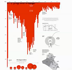 Data Visualisation has become an important aspect of our lives and the ability to present data in interesting ways has always had a role in teaching and learning. On behalf of Tableau Software, Andy Kirk recently presented a fascinating overview of the challenges of Art vs Science in data presentation.
The overall message is that the nature of the visualisation needs to be appropriate for its intent – is this exploring or explaining, thinking or feeling? So, for example, is a filter needed to explore the content or is a bold graphical statement required? 
Andy refers to his excellent web site visualisingdata.com during the presentation – the ‘resources‘ section contains a massive selection of applications that could be used, including a ‘Web’ section where most of the free online tools can be found. We have already experimented with some of these – Tableau Public and Infogram, for example – but there are many promising new ones such as Numberpicture that we hope to review as they become more polished. The ability to link to live data feeds as well as static data opens up a wide range of possibilities.
The video is a little long – around 50 minutes – and the sound is quite poor (it was a webcast after all), but is highly recommended for anyone considering creating infographics or visualisations themselves or asking students to submit assignments in this format.
Click here to launch the video (slides from the presentation – large file! 85mb)
